One Vega logo, on the site and in the app
The app now uses the same Vega logo as the website, from the menu to the sign-in page.
The logo families see on your website is now the logo they see in the app. The side navigation, sign-in, invitations, setup, and the browser tab all use the same mark. The colors around it are the same. Only the logo changed.
That shows up the moment you send an invitation. The message, the site, and the place they sign in should look like one organization. Not a website with one mark and an app with another. The people you invite should recognize where they are before they read a word.
Sign-in has a friendlier background to match. Drifting clouds in light mode, and a starry sky in dark mode. The first screen they see feels like the same Vega they saw on the site.


More that's new
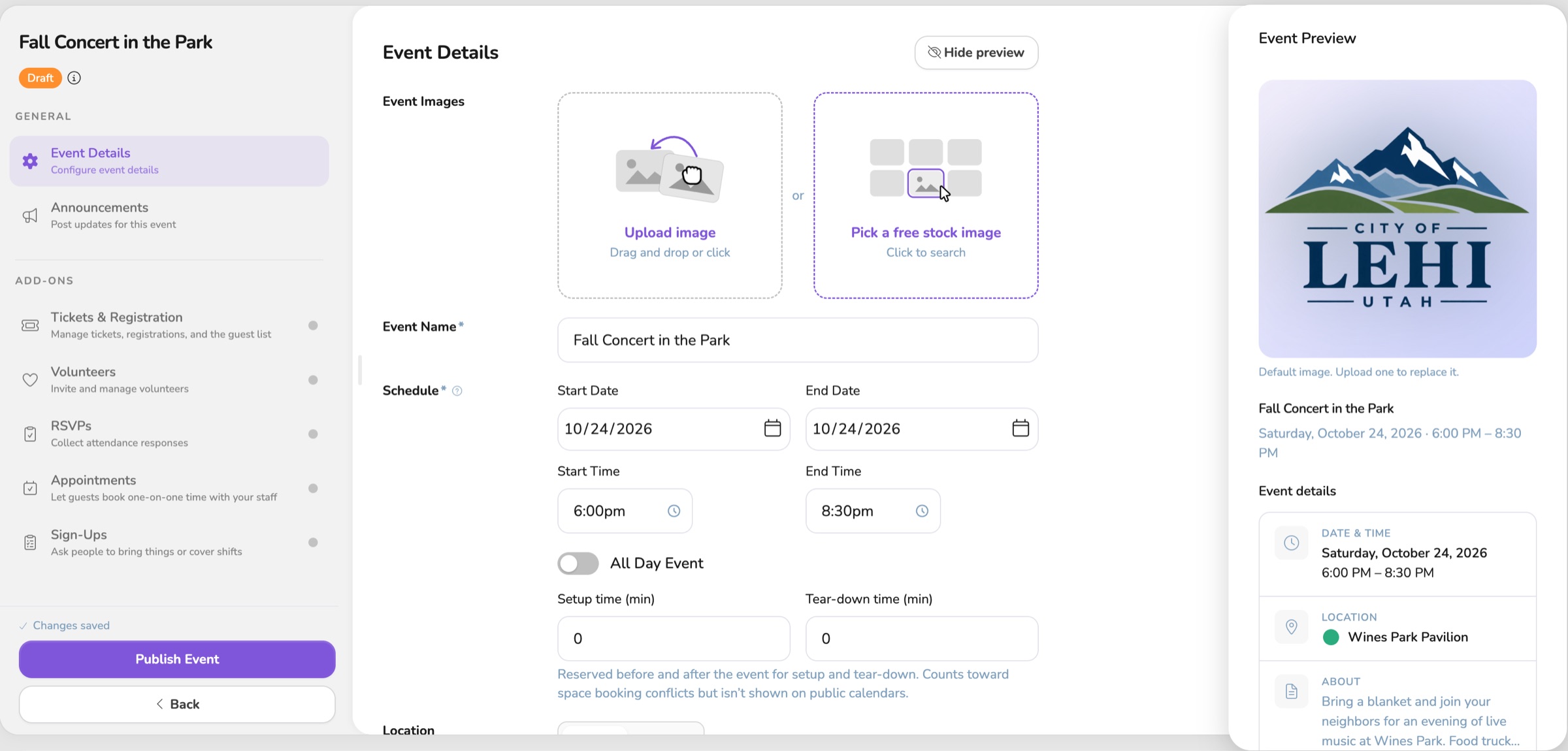
See the event before anyone else does
See the guest view while you draft, keep a live event up while you edit it, and publish a whole series at once.
Your event saves as you go
You can start an event and walk away. It saves on its own and waits in My Drafts until you publish.
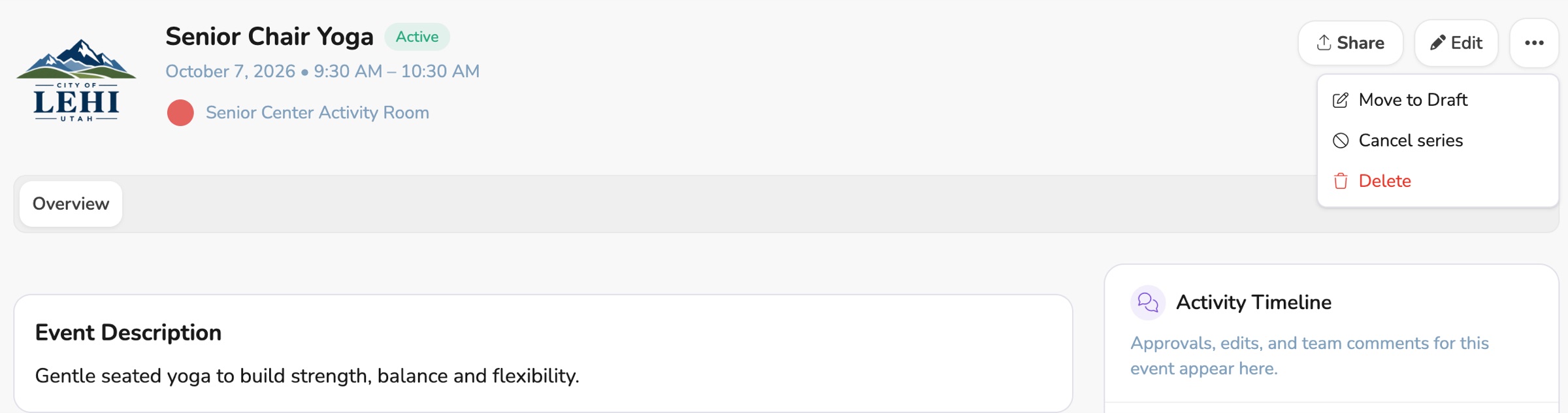
Update a live event without taking it down
Title, description, ticket, and RSVP edits stay live, and only a new time or room needs approval.